ノート
完全なサンプルコードをダウンロードするには、ここをクリックしてください
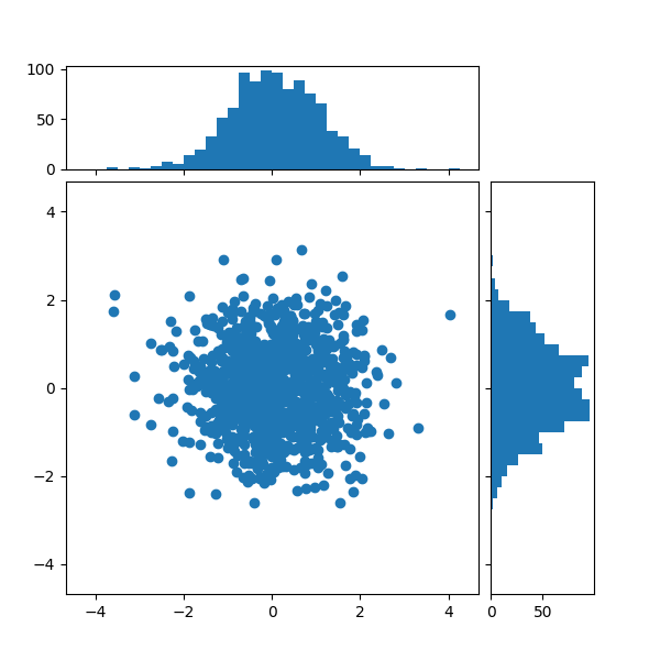
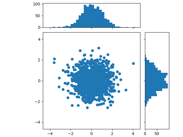
ヒストグラム付き散布図#
散布図の周辺分布をプロットの両側にヒストグラムとして表示します。
主軸と周辺軸を適切に配置するための 2 つのオプションを以下に示します。
もう少し複雑かもしれませAxes.inset_axesんが、固定縦横比で主軸を正しく処理できます。
axes_grid1
ツールキットを使用して同様の図を作成する別の方法は、散布図ヒストグラム (配置可能な軸)の
例に示されています。Figure.add_axes最後に、 (ここには示されていません)を使用して、すべての軸を絶対座標に配置することもできます。
最初に、x と y のデータを入力として受け取る関数を定義し、3 つの軸、散布図の主軸、および 2 つの周辺軸を定義します。次に、指定された軸内に散布図とヒストグラムを作成します。
import numpy as np
import matplotlib.pyplot as plt

# Fixing random state for reproducibility
np.random.seed(19680801)

# some random data
x = np.random.randn(1000)
y = np.random.randn(1000)


def scatter_hist(x, y, ax, ax_histx, ax_histy):
    # no labels
    ax_histx.tick_params(axis="x", labelbottom=False)
    ax_histy.tick_params(axis="y", labelleft=False)

    # the scatter plot:
    ax.scatter(x, y)

    # now determine nice limits by hand:
    binwidth = 0.25
    xymax = max(np.max(np.abs(x)), np.max(np.abs(y)))
    lim = (int(xymax/binwidth) + 1) * binwidth

    bins = np.arange(-lim, lim + binwidth, binwidth)
    ax_histx.hist(x, bins=bins)
    ax_histy.hist(y, bins=bins, orientation='horizontal')
gridspec を使用して軸の位置を定義する#
目的のレイアウトを実現するために、幅と高さの比率が等しくない gridspec を定義します。Figureチュートリアルに複数の軸を配置するも参照してください。
# Start with a square Figure.
fig = plt.figure(figsize=(6, 6))
# Add a gridspec with two rows and two columns and a ratio of 1 to 4 between
# the size of the marginal axes and the main axes in both directions.
# Also adjust the subplot parameters for a square plot.
gs = fig.add_gridspec(2, 2,  width_ratios=(4, 1), height_ratios=(1, 4),
                      left=0.1, right=0.9, bottom=0.1, top=0.9,
                      wspace=0.05, hspace=0.05)
# Create the Axes.
ax = fig.add_subplot(gs[1, 0])
ax_histx = fig.add_subplot(gs[0, 0], sharex=ax)
ax_histy = fig.add_subplot(gs[1, 1], sharey=ax)
# Draw the scatter plot and marginals.
scatter_hist(x, y, ax, ax_histx, ax_histy)
inset_axes を使用して軸の位置を定義する#
inset_axes主軸の外側に辺縁を配置するために使用できます。そうすることの利点は、主軸の縦横比を固定できることと、軸の位置を基準にして辺縁が常に描画されることです。
# Create a Figure, which doesn't have to be square.
fig = plt.figure(constrained_layout=True)
# Create the main axes, leaving 25% of the figure space at the top and on the
# right to position marginals.
ax = fig.add_gridspec(top=0.75, right=0.75).subplots()
# The main axes' aspect can be fixed.
ax.set(aspect=1)
# Create marginal axes, which have 25% of the size of the main axes.  Note that
# the inset axes are positioned *outside* (on the right and the top) of the
# main axes, by specifying axes coordinates greater than 1.  Axes coordinates
# less than 0 would likewise specify positions on the left and the bottom of
# the main axes.
ax_histx = ax.inset_axes([0, 1.05, 1, 0.25], sharex=ax)
ax_histy = ax.inset_axes([1.05, 0, 0.25, 1], sharey=ax)
# Draw the scatter plot and marginals.
scatter_hist(x, y, ax, ax_histx, ax_histy)

plt.show()
参考文献
この例では、次の関数、メソッド、クラス、およびモジュールの使用が示されています。
スクリプトの合計実行時間: ( 0 分 1.217 秒)