ノート
完全なサンプルコードをダウンロードするには、ここをクリックしてください
ヒストグラム#
Matplotlib でヒストグラムをプロットする方法。
import matplotlib.pyplot as plt
import numpy as np
from matplotlib import colors
from matplotlib.ticker import PercentFormatter

# Create a random number generator with a fixed seed for reproducibility
rng = np.random.default_rng(19680801)
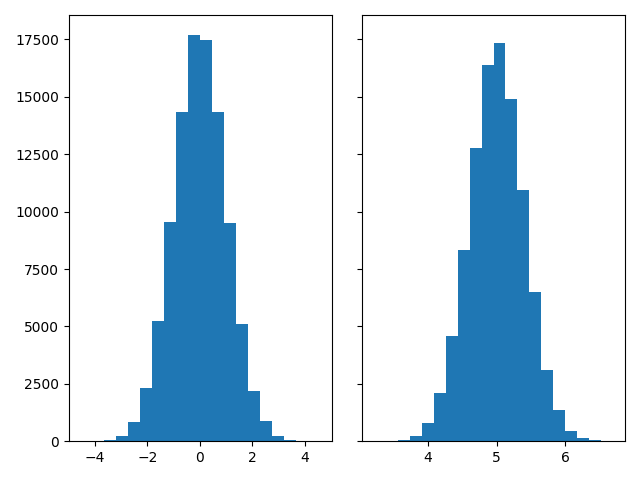
データを生成し、単純なヒストグラムをプロットします#
1D ヒストグラムを生成するには、単一の数値ベクトルのみが必要です。2D ヒストグラムの場合、2 番目のベクトルが必要です。以下の両方を生成し、各ベクトルのヒストグラムを表示します。
N_points = 100000
n_bins = 20

# Generate two normal distributions
dist1 = rng.standard_normal(N_points)
dist2 = 0.4 * rng.standard_normal(N_points) + 5

fig, axs = plt.subplots(1, 2, sharey=True, tight_layout=True)

# We can set the number of bins with the *bins* keyword argument.
axs[0].hist(dist1, bins=n_bins)
axs[1].hist(dist2, bins=n_bins)
(array([2.0000e+00, 2.1000e+01, 5.1000e+01, 2.3500e+02, 7.8100e+02,
       2.1000e+03, 4.5730e+03, 8.3390e+03, 1.2758e+04, 1.6363e+04,
       1.7345e+04, 1.4923e+04, 1.0920e+04, 6.4830e+03, 3.1070e+03,
       1.3810e+03, 4.5300e+02, 1.2200e+02, 3.6000e+01, 7.0000e+00]), array([3.20889223, 3.38336526, 3.55783829, 3.73231132, 3.90678435,
       4.08125738, 4.25573041, 4.43020344, 4.60467647, 4.7791495 ,
       4.95362253, 5.12809556, 5.30256859, 5.47704162, 5.65151465,
       5.82598768, 6.00046071, 6.17493374, 6.34940677, 6.5238798 ,
       6.69835283]), <BarContainer object of 20 artists>)
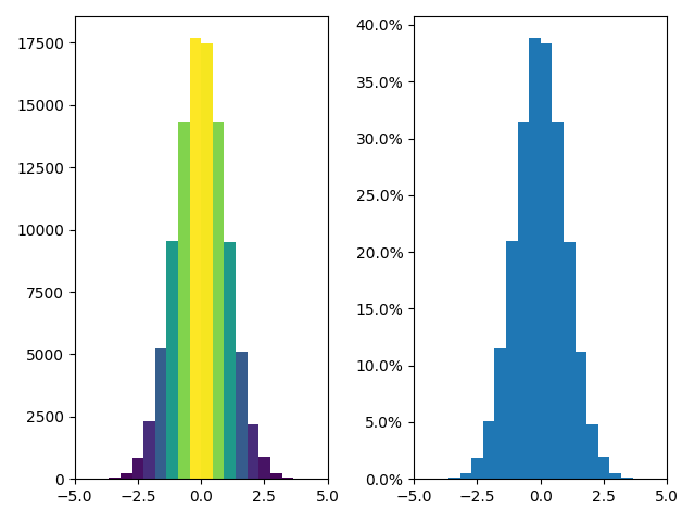
ヒストグラムの色の更新#
ヒストグラム メソッドは (とりわけ)patchesオブジェクトを返します。これにより、描画されたオブジェクトのプロパティにアクセスできます。これを使用して、好みに合わせてヒストグラムを編集できます。y 値に基づいて各バーの色を変更してみましょう。
fig, axs = plt.subplots(1, 2, tight_layout=True)

# N is the count in each bin, bins is the lower-limit of the bin
N, bins, patches = axs[0].hist(dist1, bins=n_bins)

# We'll color code by height, but you could use any scalar
fracs = N / N.max()

# we need to normalize the data to 0..1 for the full range of the colormap
norm = colors.Normalize(fracs.min(), fracs.max())

# Now, we'll loop through our objects and set the color of each accordingly
for thisfrac, thispatch in zip(fracs, patches):
    color = plt.cm.viridis(norm(thisfrac))
    thispatch.set_facecolor(color)

# We can also normalize our inputs by the total number of counts
axs[1].hist(dist1, bins=n_bins, density=True)

# Now we format the y-axis to display percentage
axs[1].yaxis.set_major_formatter(PercentFormatter(xmax=1))
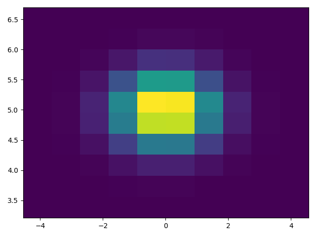
2D ヒストグラムをプロットする#
2D ヒストグラムをプロットするには、ヒストグラムの各軸に対応する、同じ長さの 2 つのベクトルのみが必要です。
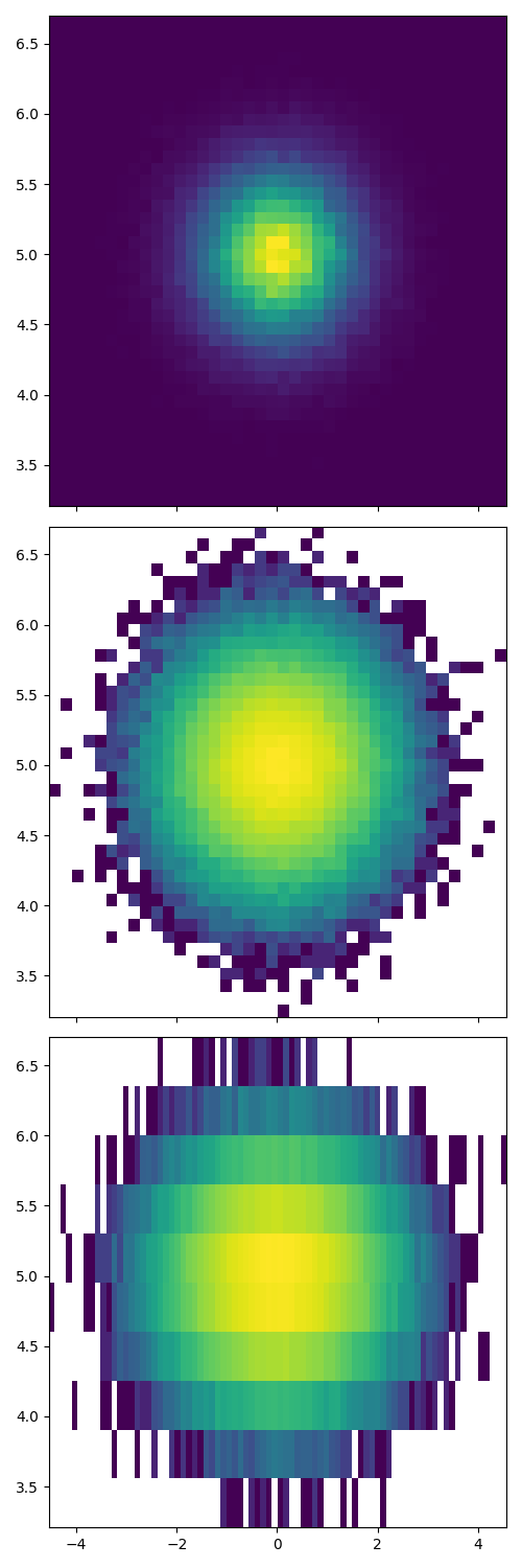
ヒストグラムのカスタマイズ#
2D ヒストグラムのカスタマイズは 1D の場合と似ており、ビン サイズや色の正規化などの視覚的なコンポーネントを制御できます。
fig, axs = plt.subplots(3, 1, figsize=(5, 15), sharex=True, sharey=True,
                        tight_layout=True)

# We can increase the number of bins on each axis
axs[0].hist2d(dist1, dist2, bins=40)

# As well as define normalization of the colors
axs[1].hist2d(dist1, dist2, bins=40, norm=colors.LogNorm())

# We can also define custom numbers of bins for each axis
axs[2].hist2d(dist1, dist2, bins=(80, 10), norm=colors.LogNorm())

plt.show()
参考文献
この例では、次の関数、メソッド、クラス、およびモジュールの使用が示されています。
スクリプトの合計実行時間: ( 0 分 2.108 秒)