ノート
完全なサンプルコードをダウンロードするには、ここをクリックしてください
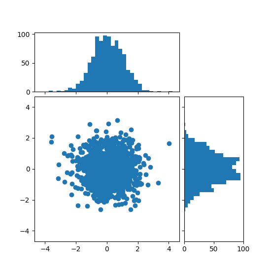
散布ヒストグラム (配置可能な軸) #
散布図の周辺分布をプロットの両側にヒストグラムとして表示します。
主軸と周辺軸を適切に配置するために、軸の位置は によって定義され、 によってDivider生成されmake_axes_locatableます。DividerAPI では、軸のサイズとパッドをインチ単位で設定できることに注意してください。これが主な機能です。
軸のサイズとパッドをメインの Figure に対して相対的に設定したい場合は、 ヒストグラムを使用した散布図の例を参照してください。
import numpy as np
import matplotlib.pyplot as plt
from mpl_toolkits.axes_grid1 import make_axes_locatable

# Fixing random state for reproducibility
np.random.seed(19680801)

# the random data
x = np.random.randn(1000)
y = np.random.randn(1000)


fig, ax = plt.subplots(figsize=(5.5, 5.5))

# the scatter plot:
ax.scatter(x, y)

# Set aspect of the main axes.
ax.set_aspect(1.)

# create new axes on the right and on the top of the current axes
divider = make_axes_locatable(ax)
# below height and pad are in inches
ax_histx = divider.append_axes("top", 1.2, pad=0.1, sharex=ax)
ax_histy = divider.append_axes("right", 1.2, pad=0.1, sharey=ax)

# make some labels invisible
ax_histx.xaxis.set_tick_params(labelbottom=False)
ax_histy.yaxis.set_tick_params(labelleft=False)

# now determine nice limits by hand:
binwidth = 0.25
xymax = max(np.max(np.abs(x)), np.max(np.abs(y)))
lim = (int(xymax/binwidth) + 1)*binwidth

bins = np.arange(-lim, lim + binwidth, binwidth)
ax_histx.hist(x, bins=bins)
ax_histy.hist(y, bins=bins, orientation='horizontal')

# the xaxis of ax_histx and yaxis of ax_histy are shared with ax,
# thus there is no need to manually adjust the xlim and ylim of these
# axis.

ax_histx.set_yticks([0, 50, 100])
ax_histy.set_xticks([0, 50, 100])

plt.show()
参考文献
この例では、次の関数、メソッド、クラス、およびモジュールの使用が示されています。