ノート
完全なサンプルコードをダウンロードするには、ここをクリックしてください
とアルファの間を埋める#
このfill_between関数は、範囲を示すのに役立つ最小境界と最大境界の間に影付きの領域を生成します。塗りつぶしを論理範囲と組み合わせる非常に便利なwhere引数があります。たとえば、あるしきい値を超える曲線を塗りつぶすだけです。
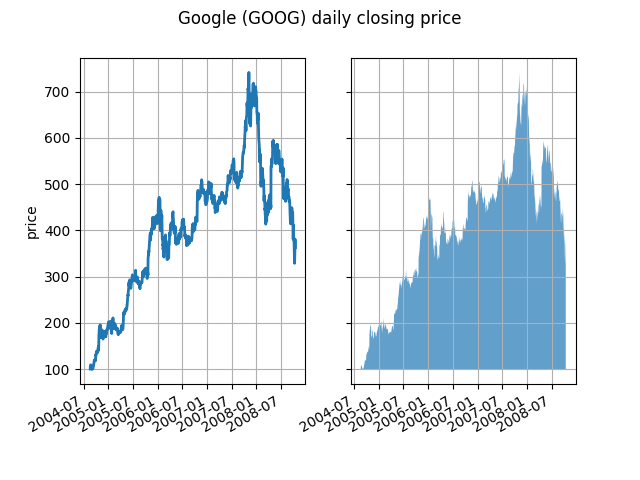
最も基本的なレベルでfill_betweenは、グラフの外観を向上させるために使用できます。財務データの 2 つのグラフを、左側の単純な折れ線グラフと右側の塗りつぶされた線で比較してみましょう。
import matplotlib.pyplot as plt
import numpy as np
import matplotlib.cbook as cbook


# load up some sample financial data
r = (cbook.get_sample_data('goog.npz', np_load=True)['price_data']
     .view(np.recarray))
# create two subplots with the shared x and y axes
fig, (ax1, ax2) = plt.subplots(1, 2, sharex=True, sharey=True)

pricemin = r.close.min()

ax1.plot(r.date, r.close, lw=2)
ax2.fill_between(r.date, pricemin, r.close, alpha=0.7)

for ax in ax1, ax2:
    ax.grid(True)
    ax.label_outer()

ax1.set_ylabel('price')

fig.suptitle('Google (GOOG) daily closing price')
fig.autofmt_xdate()
ここではアルファチャンネルは必要ありませんが、より視覚的に魅力的なプロットのために色を柔らかくするために使用できます。他の例では、以下で説明するように、影付きの領域を重ねることができ、アルファを使用すると両方を表示できるため、アルファ チャネルは機能的に役立ちます。ポストスクリプト形式はアルファをサポートしていないことに注意してください (これはポストスクリプトの制限であり、matplotlib の制限ではありません)。したがって、アルファを使用する場合は、図を PNG、PDF、または SVG で保存してください。
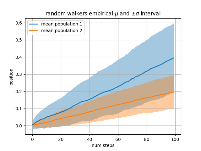
次の例では、ステップが抽出される正規分布の平均と標準偏差が異なるランダム ウォーカーの 2 つの母集団を計算します。塗りつぶされた領域を使用して、母集団の平均位置の +/- 1 標準偏差をプロットします。ここで、アルファ チャンネルは美的だけでなく便利です。
# Fixing random state for reproducibility
np.random.seed(19680801)

Nsteps, Nwalkers = 100, 250
t = np.arange(Nsteps)

# an (Nsteps x Nwalkers) array of random walk steps
S1 = 0.004 + 0.02*np.random.randn(Nsteps, Nwalkers)
S2 = 0.002 + 0.01*np.random.randn(Nsteps, Nwalkers)

# an (Nsteps x Nwalkers) array of random walker positions
X1 = S1.cumsum(axis=0)
X2 = S2.cumsum(axis=0)


# Nsteps length arrays empirical means and standard deviations of both
# populations over time
mu1 = X1.mean(axis=1)
sigma1 = X1.std(axis=1)
mu2 = X2.mean(axis=1)
sigma2 = X2.std(axis=1)

# plot it!
fig, ax = plt.subplots(1)
ax.plot(t, mu1, lw=2, label='mean population 1')
ax.plot(t, mu2, lw=2, label='mean population 2')
ax.fill_between(t, mu1+sigma1, mu1-sigma1, facecolor='C0', alpha=0.4)
ax.fill_between(t, mu2+sigma2, mu2-sigma2, facecolor='C1', alpha=0.4)
ax.set_title(r'random walkers empirical $\mu$ and $\pm \sigma$ interval')
ax.legend(loc='upper left')
ax.set_xlabel('num steps')
ax.set_ylabel('position')
ax.grid()
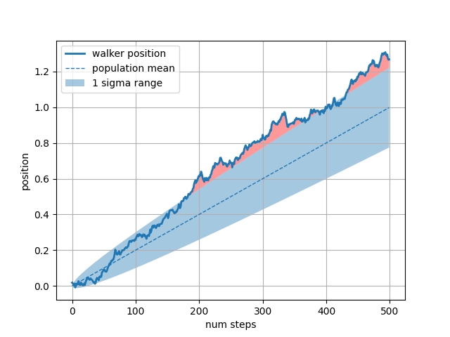
whereキーワード引数は、グラフの特定の領域を強調表示するのに非常に便利です。wherex、ymin、および ymax 引数と同じ長さのブール マスクを取り、ブール マスクが True である領域のみを塗りつぶします。以下の例では、単一のランダム ウォーカーをシミュレートし、母集団の位置の分析平均と標準偏差を計算します。母平均は破線で示され、平均からのプラス/マイナス 1 シグマ偏差は塗りつぶされた領域として示されます。where マスクを使用して、ウォーカーが 1 シグマ境界の外側にある領域を見つけ、その領域を赤く塗りつぶします。X > upper_bound
# Fixing random state for reproducibility
np.random.seed(1)

Nsteps = 500
t = np.arange(Nsteps)

mu = 0.002
sigma = 0.01

# the steps and position
S = mu + sigma*np.random.randn(Nsteps)
X = S.cumsum()

# the 1 sigma upper and lower analytic population bounds
lower_bound = mu*t - sigma*np.sqrt(t)
upper_bound = mu*t + sigma*np.sqrt(t)

fig, ax = plt.subplots(1)
ax.plot(t, X, lw=2, label='walker position')
ax.plot(t, mu*t, lw=1, label='population mean', color='C0', ls='--')
ax.fill_between(t, lower_bound, upper_bound, facecolor='C0', alpha=0.4,
                label='1 sigma range')
ax.legend(loc='upper left')

# here we use the where argument to only fill the region where the
# walker is above the population 1 sigma boundary
ax.fill_between(t, upper_bound, X, where=X > upper_bound, fc='red', alpha=0.4)
ax.fill_between(t, lower_bound, X, where=X < lower_bound, fc='red', alpha=0.4)
ax.set_xlabel('num steps')
ax.set_ylabel('position')
ax.grid()
塗りつぶされた領域のもう 1 つの便利な使用法は、Axes の水平または垂直スパンを強調表示することです。そのため、Matplotlib にはヘルパー関数
axhspanとaxvspan. axhspan デモを参照してください
。
plt.show()
スクリプトの合計実行時間: ( 0 分 1.566 秒)