ノート
完全なサンプルコードをダウンロードするには、ここをクリックしてください
2 次元データセットの信頼楕円をプロットする#
この例では、ピアソン相関係数を使用して、2 次元データセットの信頼楕円をプロットする方法を示します。
正しいジオメトリを取得するために使用されるアプローチについて説明し、ここで証明します。
https://carstenschelp.github.io/2018/09/14/Plot_Confidence_Ellipse_001.html
この方法は、反復固有分解アルゴリズムの使用を回避し、正規化された共分散行列 (ピアソン相関係数と相関係数で構成される) が特に扱いやすいという事実を利用します。
import numpy as np
import matplotlib.pyplot as plt
from matplotlib.patches import Ellipse
import matplotlib.transforms as transforms
プロット関数自体#
この関数は、指定された配列のような変数 x と y の共分散の信頼楕円をプロットします。楕円は、指定された軸オブジェクト ax にプロットされます。
楕円の半径は、標準偏差の数である n_std によって制御できます。デフォルト値は 3 で、データがこれらの例のように正規分布している場合、楕円は点の 98.9% を囲みます (1 次元の 3 標準偏差にはデータの 99.7% が含まれ、2 次元のデータの 98.9% に相当します)。 D)。
def confidence_ellipse(x, y, ax, n_std=3.0, facecolor='none', **kwargs):
    """
    Create a plot of the covariance confidence ellipse of *x* and *y*.

    Parameters
    ----------
    x, y : array-like, shape (n, )
        Input data.

    ax : matplotlib.axes.Axes
        The axes object to draw the ellipse into.

    n_std : float
        The number of standard deviations to determine the ellipse's radiuses.

    **kwargs
        Forwarded to `~matplotlib.patches.Ellipse`

    Returns
    -------
    matplotlib.patches.Ellipse
    """
    if x.size != y.size:
        raise ValueError("x and y must be the same size")

    cov = np.cov(x, y)
    pearson = cov[0, 1]/np.sqrt(cov[0, 0] * cov[1, 1])
    # Using a special case to obtain the eigenvalues of this
    # two-dimensional dataset.
    ell_radius_x = np.sqrt(1 + pearson)
    ell_radius_y = np.sqrt(1 - pearson)
    ellipse = Ellipse((0, 0), width=ell_radius_x * 2, height=ell_radius_y * 2,
                      facecolor=facecolor, **kwargs)

    # Calculating the standard deviation of x from
    # the squareroot of the variance and multiplying
    # with the given number of standard deviations.
    scale_x = np.sqrt(cov[0, 0]) * n_std
    mean_x = np.mean(x)

    # calculating the standard deviation of y ...
    scale_y = np.sqrt(cov[1, 1]) * n_std
    mean_y = np.mean(y)

    transf = transforms.Affine2D() \
        .rotate_deg(45) \
        .scale(scale_x, scale_y) \
        .translate(mean_x, mean_y)

    ellipse.set_transform(transf + ax.transData)
    return ax.add_patch(ellipse)
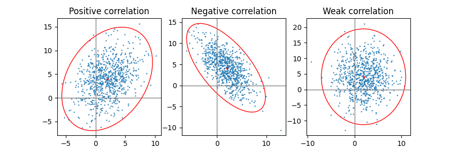
正、負、弱い相関#
x と y のスケーリングが異なるため、弱い相関 (右) の形状は円ではなく楕円であることに注意してください。ただし、x と y が無相関であることは、楕円の軸が座標系の x 軸と y 軸に整列していることによって示されます。
np.random.seed(0)

PARAMETERS = {
    'Positive correlation': [[0.85, 0.35],
                             [0.15, -0.65]],
    'Negative correlation': [[0.9, -0.4],
                             [0.1, -0.6]],
    'Weak correlation': [[1, 0],
                         [0, 1]],
}

mu = 2, 4
scale = 3, 5

fig, axs = plt.subplots(1, 3, figsize=(9, 3))
for ax, (title, dependency) in zip(axs, PARAMETERS.items()):
    x, y = get_correlated_dataset(800, dependency, mu, scale)
    ax.scatter(x, y, s=0.5)

    ax.axvline(c='grey', lw=1)
    ax.axhline(c='grey', lw=1)

    confidence_ellipse(x, y, ax, edgecolor='red')

    ax.scatter(mu[0], mu[1], c='red', s=3)
    ax.set_title(title)

plt.show()
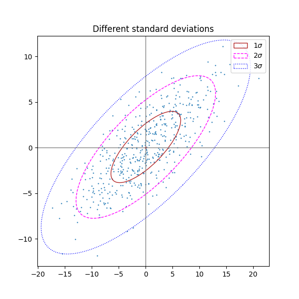
標準偏差の数が異なる#
n_std = 3 (青)、2 (紫)、1 (赤) のプロット
fig, ax_nstd = plt.subplots(figsize=(6, 6))

dependency_nstd = [[0.8, 0.75],
                   [-0.2, 0.35]]
mu = 0, 0
scale = 8, 5

ax_nstd.axvline(c='grey', lw=1)
ax_nstd.axhline(c='grey', lw=1)

x, y = get_correlated_dataset(500, dependency_nstd, mu, scale)
ax_nstd.scatter(x, y, s=0.5)

confidence_ellipse(x, y, ax_nstd, n_std=1,
                   label=r'$1\sigma$', edgecolor='firebrick')
confidence_ellipse(x, y, ax_nstd, n_std=2,
                   label=r'$2\sigma$', edgecolor='fuchsia', linestyle='--')
confidence_ellipse(x, y, ax_nstd, n_std=3,
                   label=r'$3\sigma$', edgecolor='blue', linestyle=':')

ax_nstd.scatter(mu[0], mu[1], c='red', s=3)
ax_nstd.set_title('Different standard deviations')
ax_nstd.legend()
plt.show()
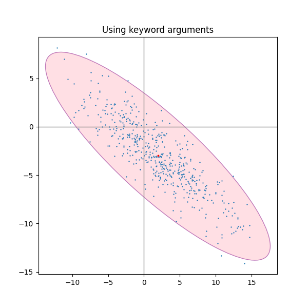
キーワード引数の使用#
matplotlib.patches.Patch楕円をさまざまな方法でレンダリングするには、for で指定されたキーワード引数を使用します。
fig, ax_kwargs = plt.subplots(figsize=(6, 6))
dependency_kwargs = [[-0.8, 0.5],
                     [-0.2, 0.5]]
mu = 2, -3
scale = 6, 5

ax_kwargs.axvline(c='grey', lw=1)
ax_kwargs.axhline(c='grey', lw=1)

x, y = get_correlated_dataset(500, dependency_kwargs, mu, scale)
# Plot the ellipse with zorder=0 in order to demonstrate
# its transparency (caused by the use of alpha).
confidence_ellipse(x, y, ax_kwargs,
                   alpha=0.5, facecolor='pink', edgecolor='purple', zorder=0)

ax_kwargs.scatter(x, y, s=0.5)
ax_kwargs.scatter(mu[0], mu[1], c='red', s=3)
ax_kwargs.set_title('Using keyword arguments')

fig.subplots_adjust(hspace=0.25)
plt.show()
参考文献
この例では、次の関数、メソッド、クラス、およびモジュールの使用が示されています。
スクリプトの合計実行時間: ( 0 分 1.609 秒)